T2 [desktop] vs ROBERTO
>> PROJECT – T2 Desktop Concept <<:// INTRO
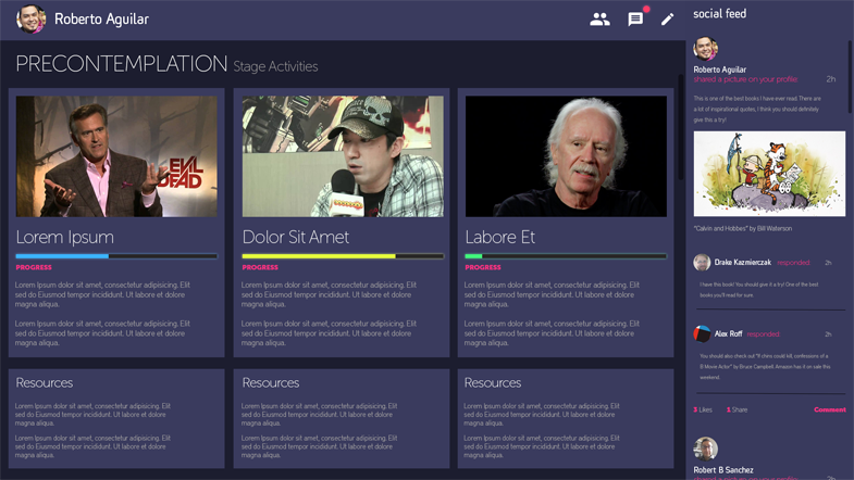
One of my first tasks at the National Center for Telehealth & Technology was to create a desktop concept for an app which focused on user generated content & it’s own social network. We chose to go with a flat design aesthetic for the concept, this would provide a clear highlight for the body of the content. Having in mind the great number of possibilities which each user could bring, organization and simplicity were key.
:// PRODUCTION
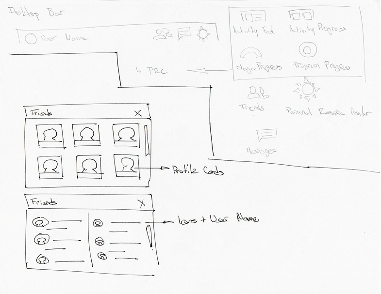
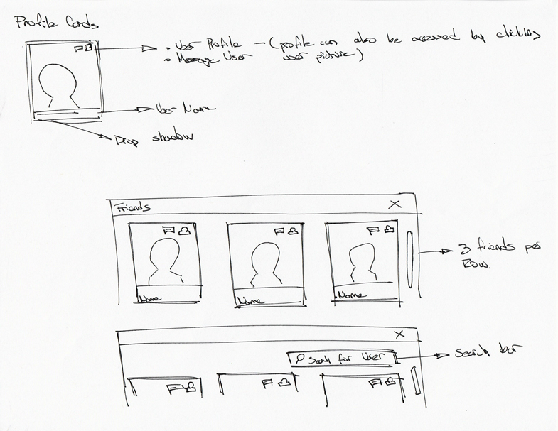
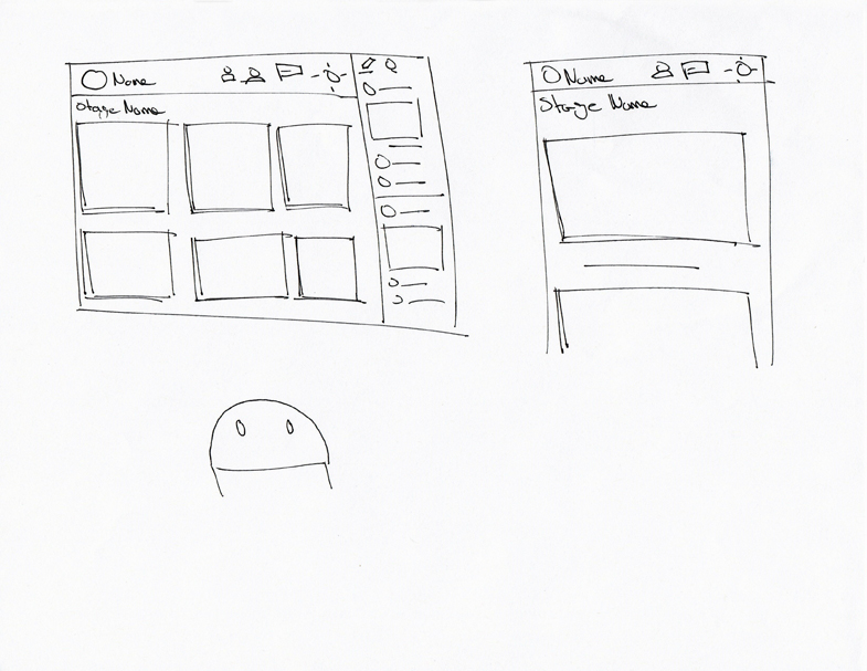
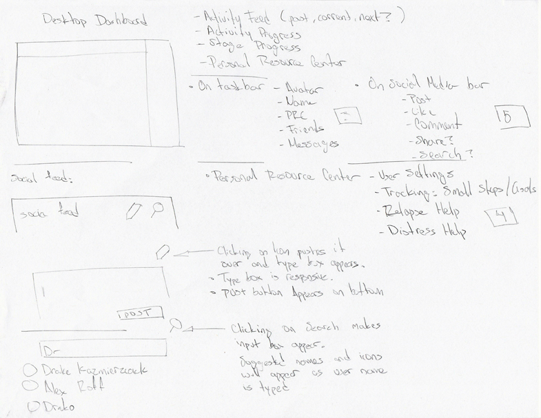
The first pieces of artwork created for this endeavor were not digital at all. Everything was kept classic, pencil and ink on paper. This helped with the large number of iterations which would come ahead.
Under the watchful eye of Art Director Robb Sanchez the layout and format were decided upon. Add the UI/UX expertise from General Assembly craftsmen Lalo Carter and Mary Pouleson.
Sketches
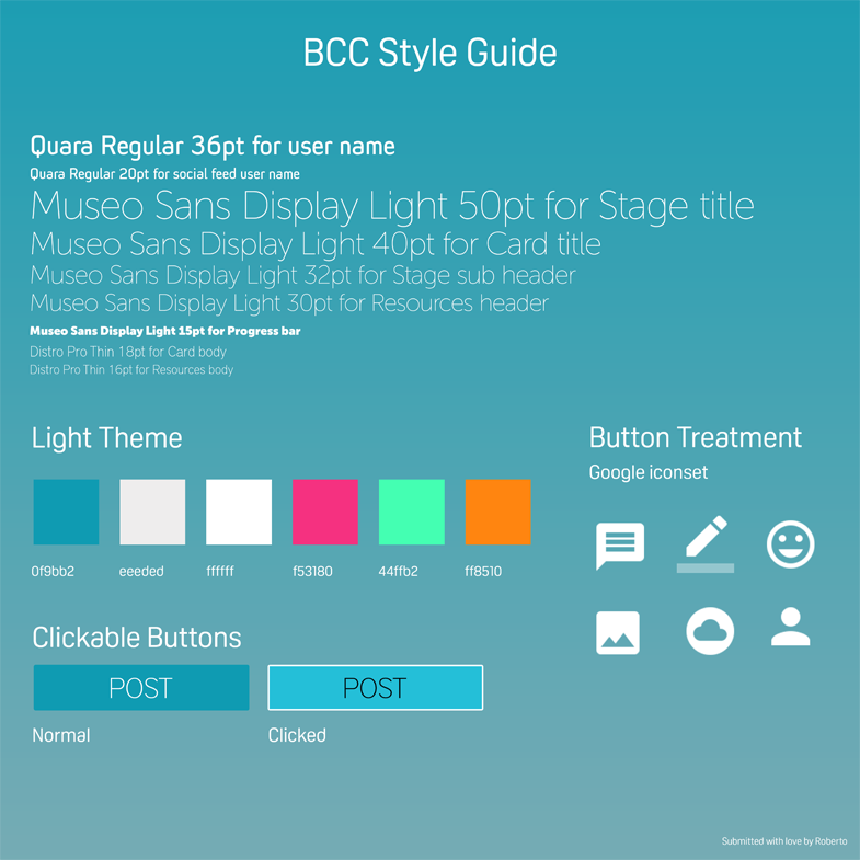
Style Tile
BONUS: Dark Theme concept
