T2 [BCC Project] vs ROBERTO
>> PROJECT – T2 BCC Project <<:// INTRO
The BCC Project is a Mobile App which helps Service Members in their efforts to change any specific behavior. One of my first tasks was to develop the look and design aesthetic for the project. My duties on this project included: Visual design, color palette, background design, reward design, personas and context scenarios.
:// PRODUCTION
The first step? Firing up my Pinterest boards to gather design inspiration and present it to the team.
Mood Boards
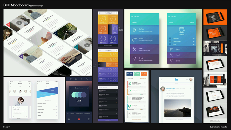
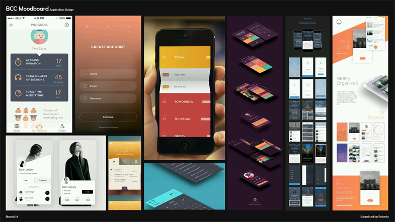
After the mood boards, I developed the personas and context scenarios in order to have a vision of the functionality for the app.
. Personas
Once the design language was settled on, we decided to update the name for the App since “BCC” seems vague. Seven words made the final cut from a proposed roster of 50 plus names. I presented the top seven names along with Font possibilities to the team.
Font & Name Roster
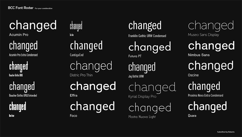
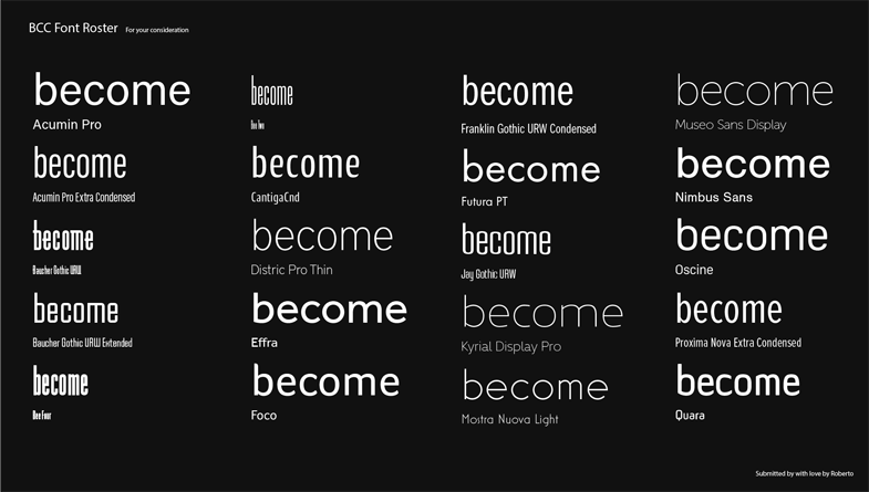
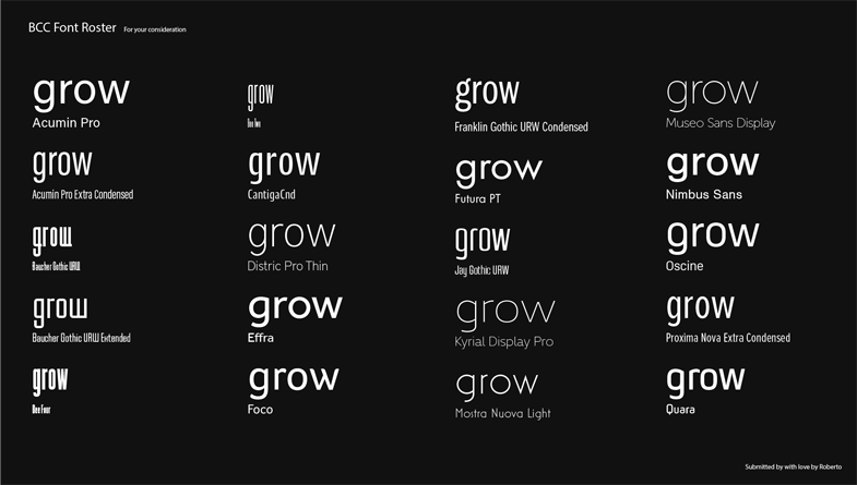
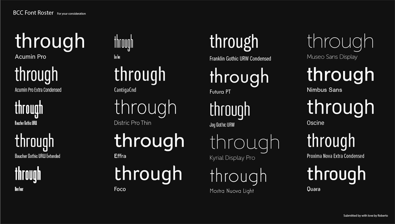
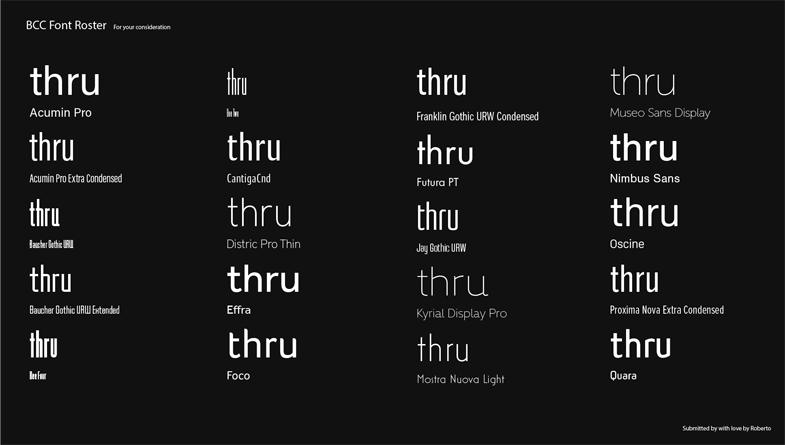
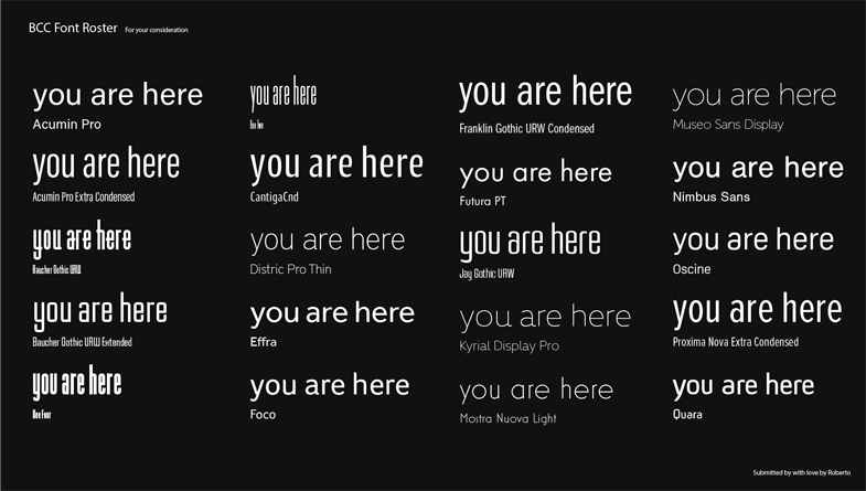
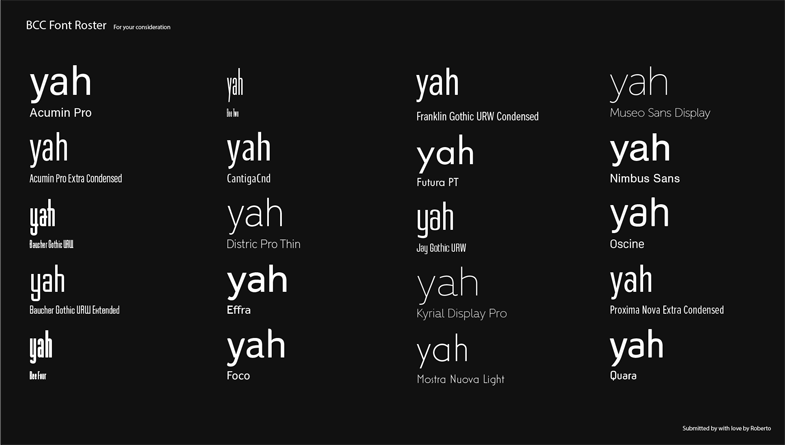
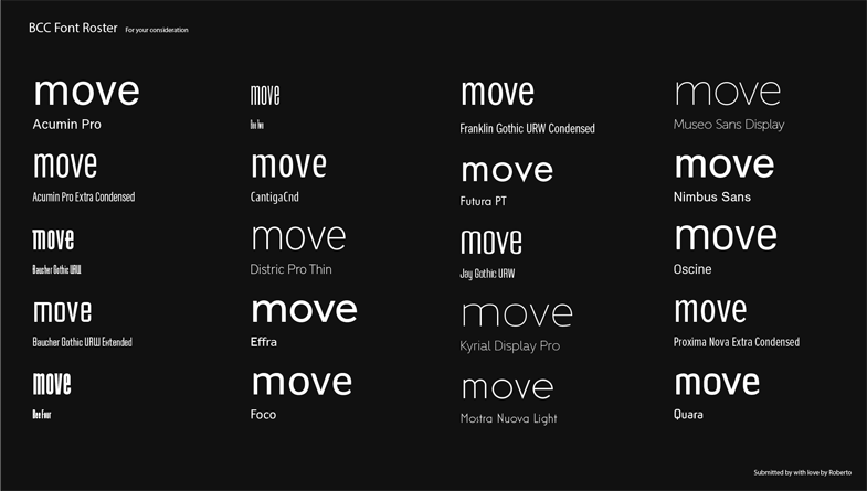
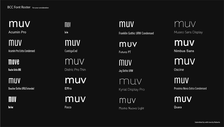
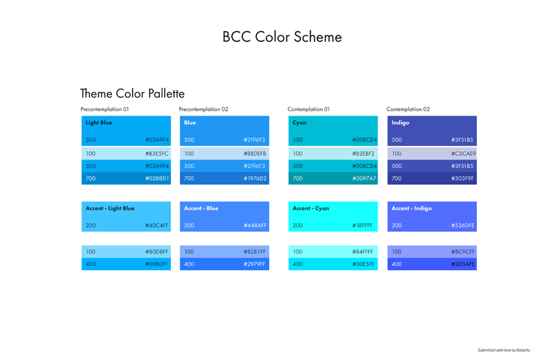
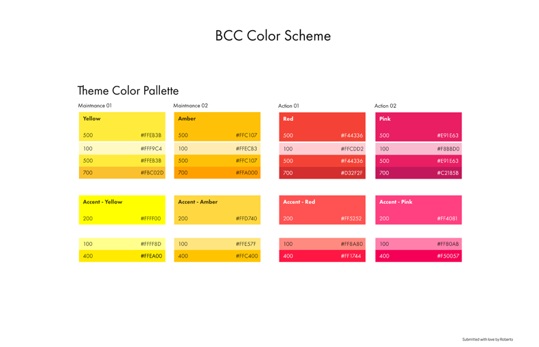
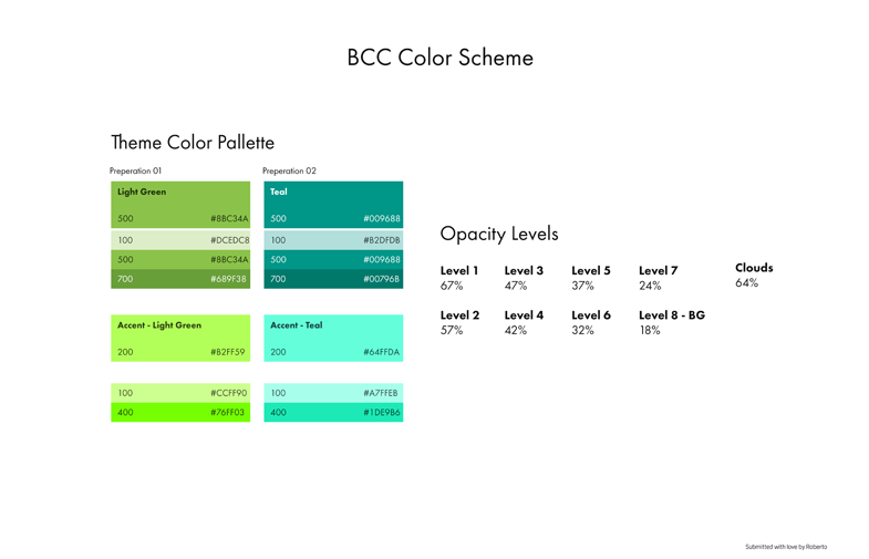
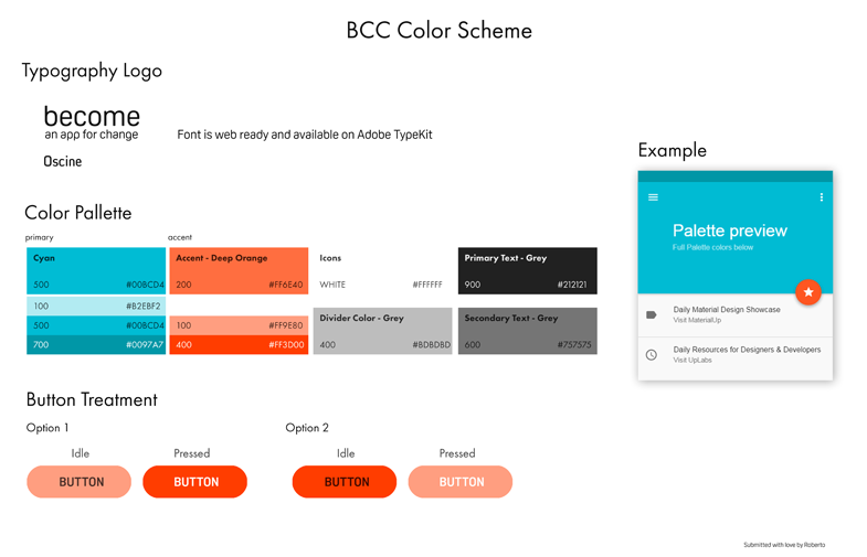
After the final name was chosen we decided to select the color palette for the App. Using the Transtheoretical Model for change we decided to have each stage represented by a specific color which helps inspire change throughout that specific stage within the program.
BCC Color Scheme
BCC App Background
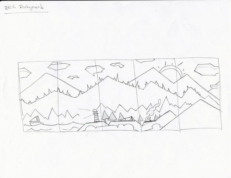
I was then tasked with creating a background for the App with these rules in mind:
- An Environment which inspired the user’s journey from beginning to end.
- Having a gradient which symbolized each stage within the change process.
- Make it a perspective point of view.
Roberto: What you need fam?
T2: We need a background for the App. Make it look awesome.
Roberto: Say no more.

Intro Animation
Intro Animation Artists
- Marc Wheeler – Storyboards, Animation, Art
- Alexander Roff – Storyboards, Animation, Art
- Drake Kazmierczak – Storyboards, Animation, Art
- Roberto Aguilar – Background Art
Background sketches
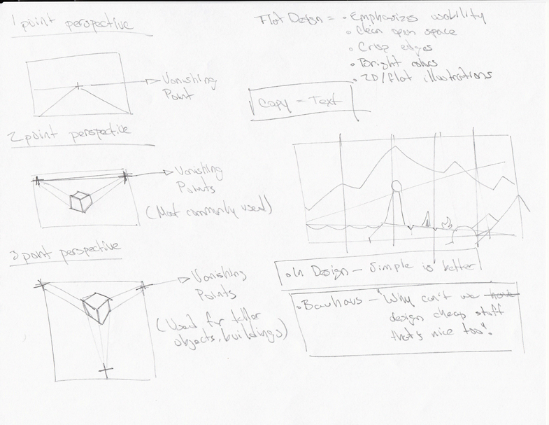
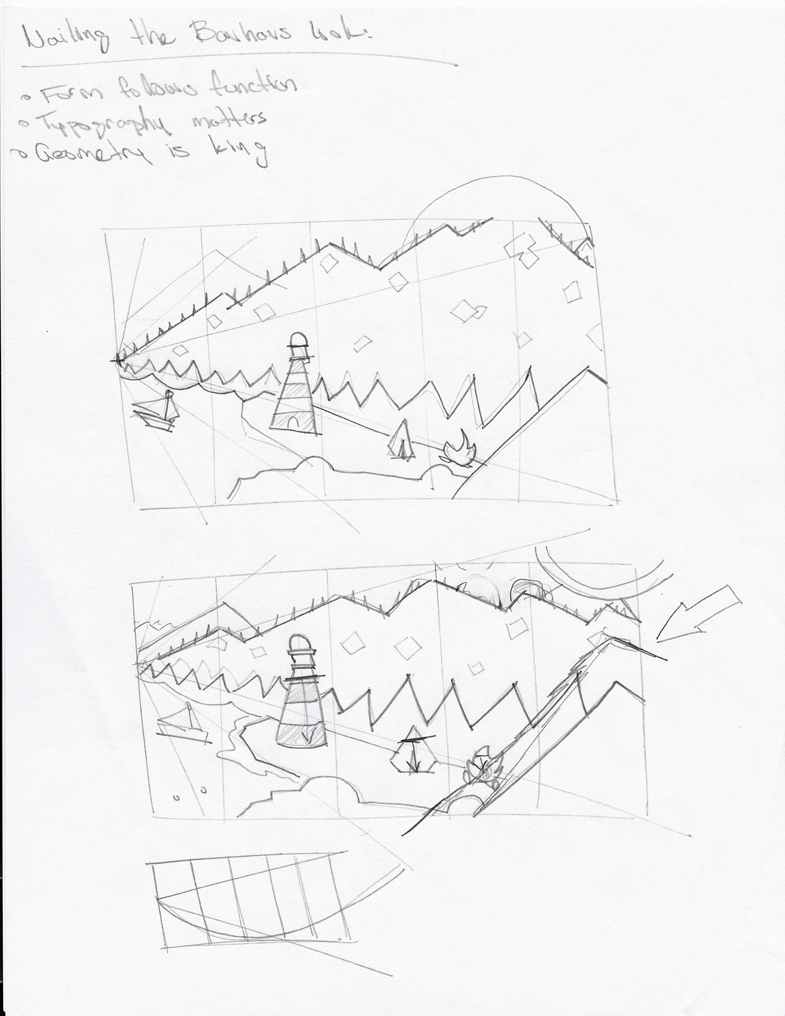
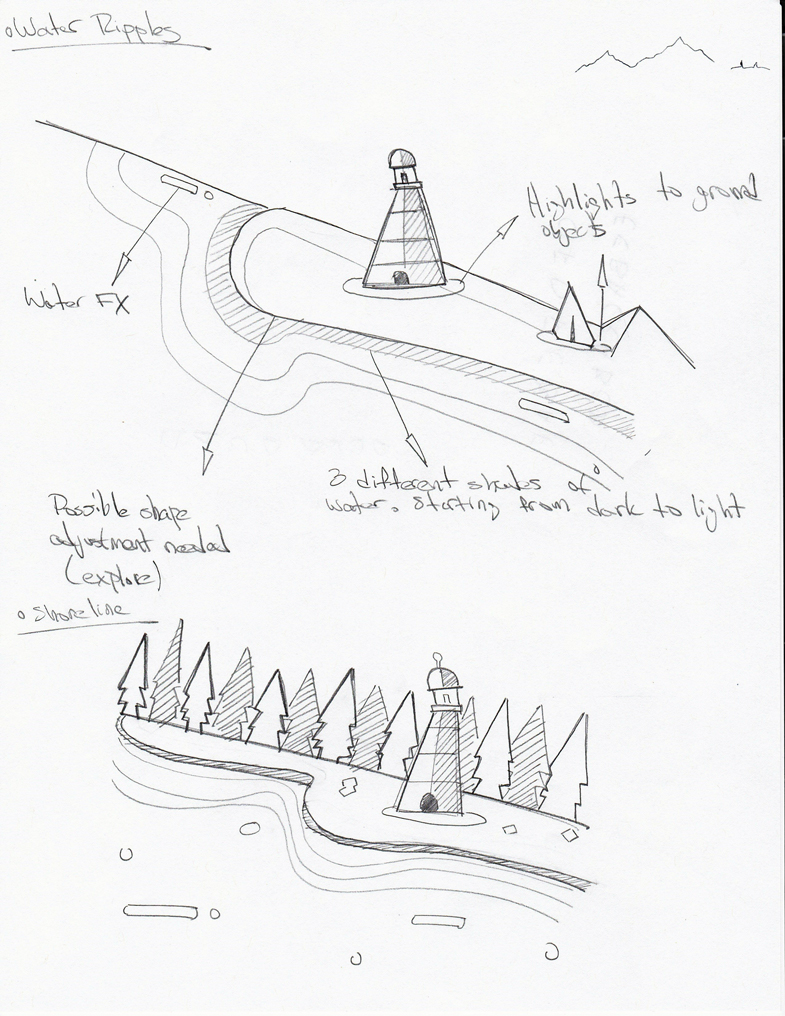
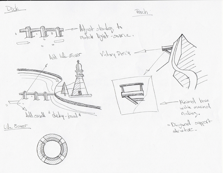
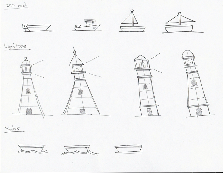
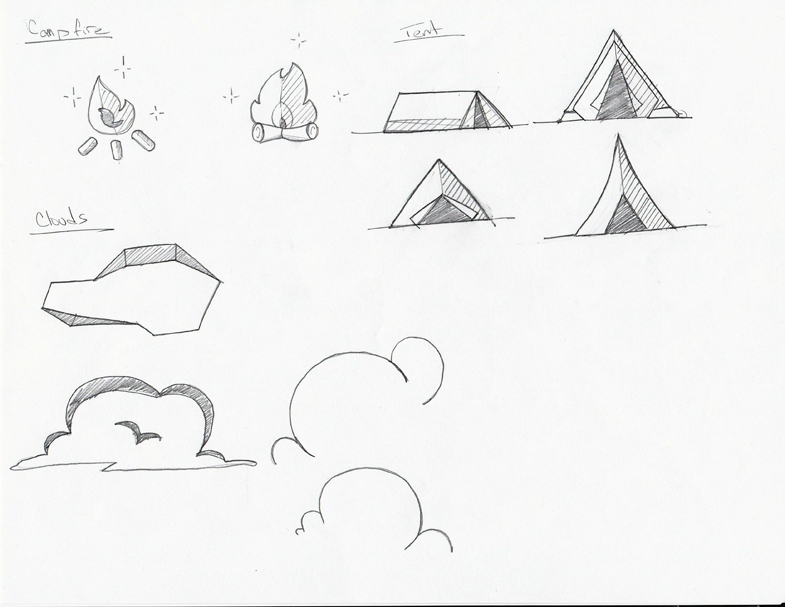
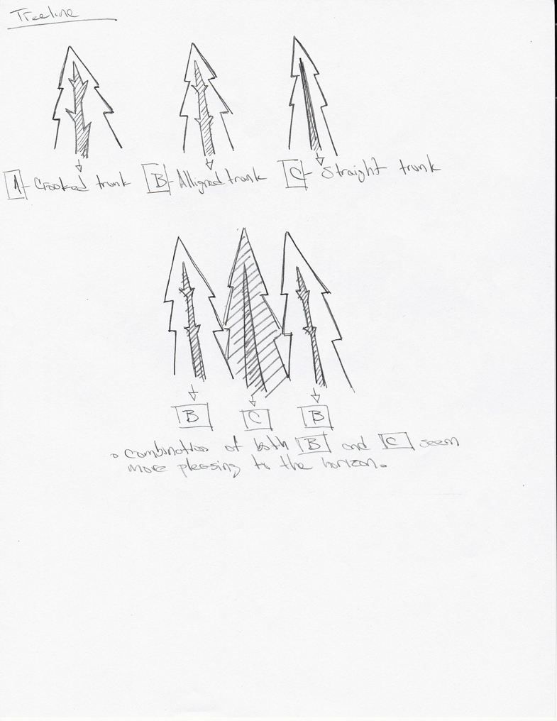
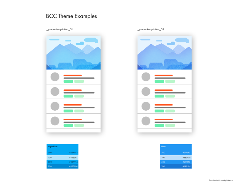
Once the design language and color palette were in place, I created a mobile theme example for project management.
BCC Theme Examples
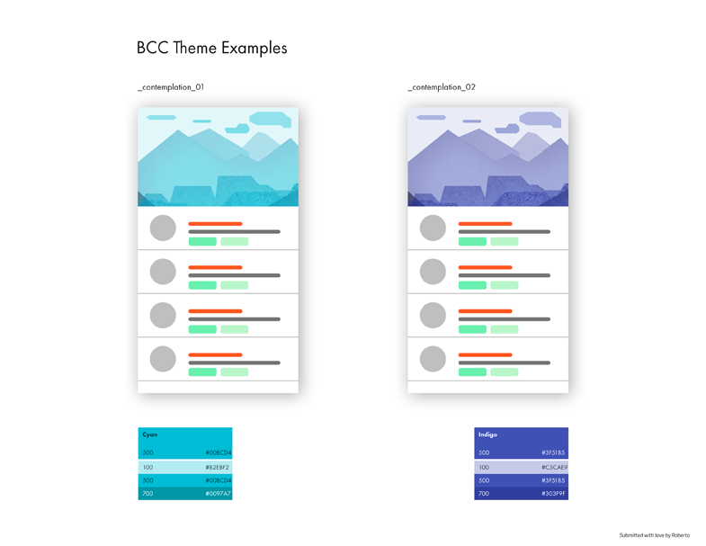
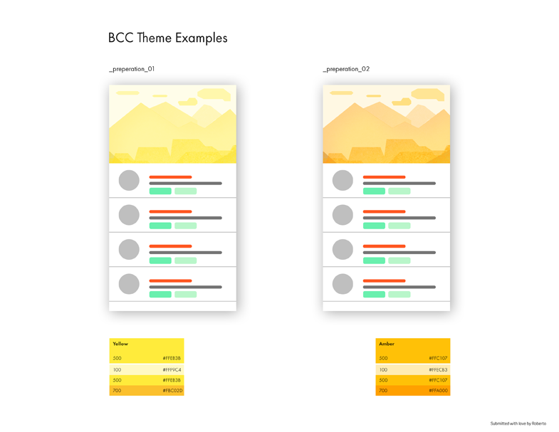
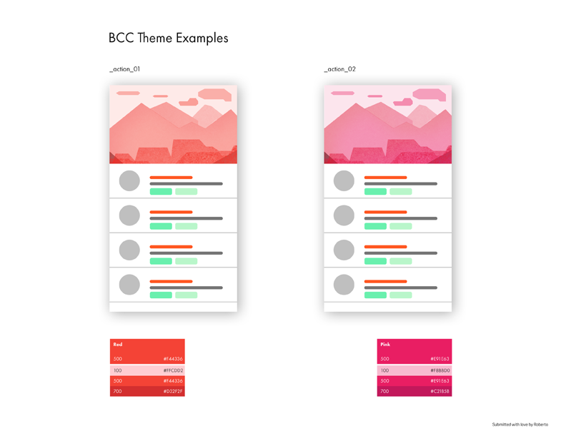
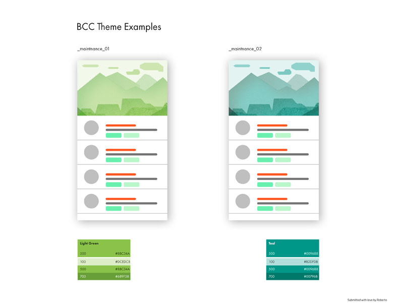
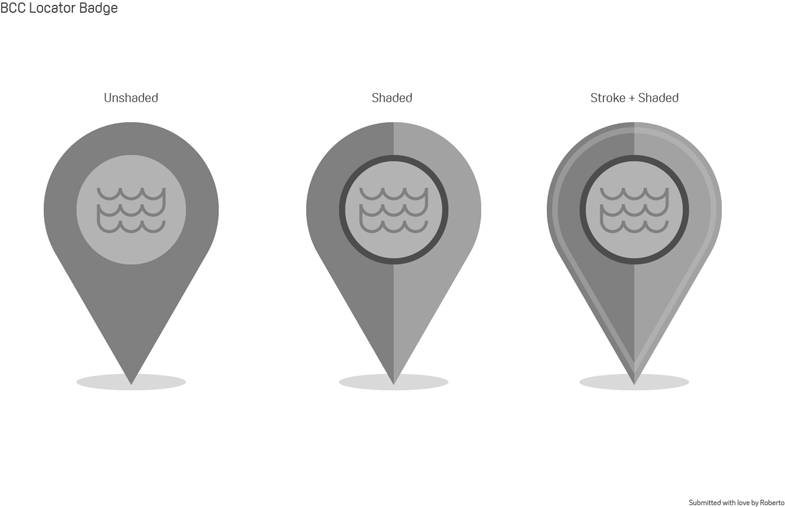
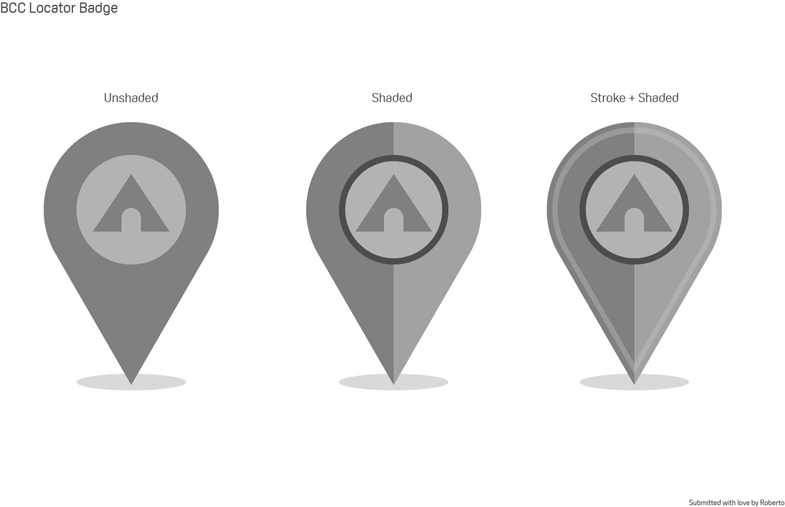
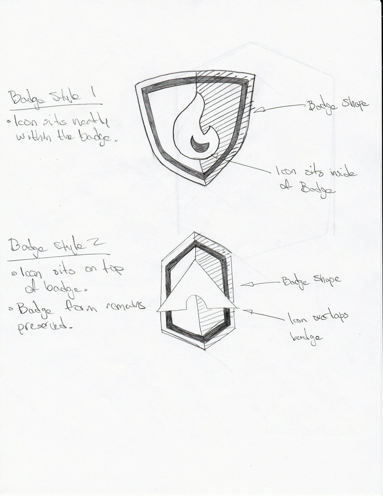
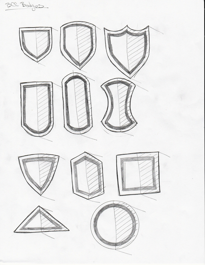
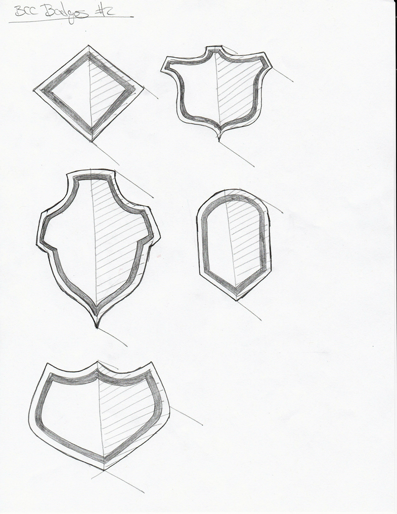
We also developed badges which users would be rewarded as they made their way through the App.
BCC Badge Development

Badge Sketches
This project would have never been possible without the help of the fantastic Design Collective. I was fortunate to pick these fantastic creatives’ brains as I developed each deliverable for this project.
Design Collective
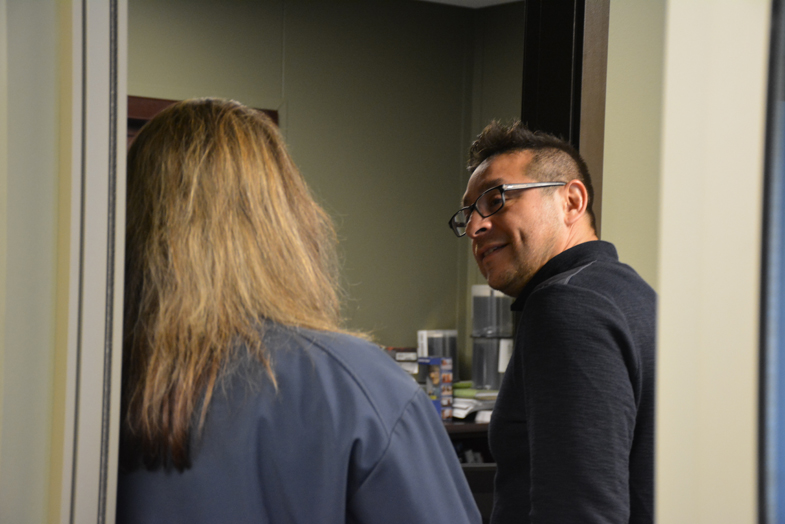
Art Director Robb Sanchez provided guidance as I stumbled through the darkness of development.
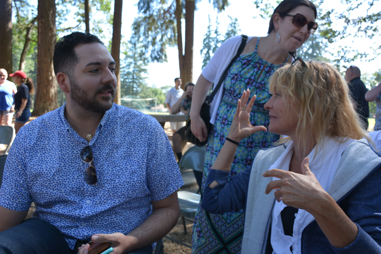
Coach Carter and Coach Pouleson discussing UI/UX.
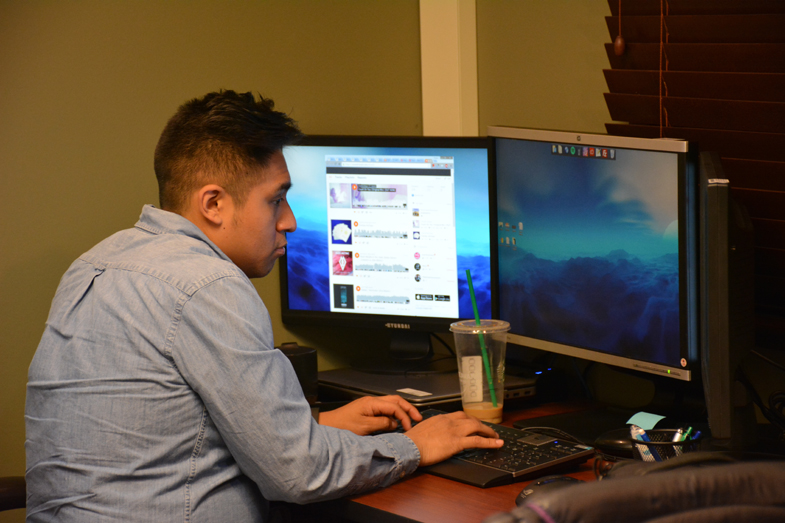
Coach Rios provided invaluable help when it came to the development of Personas and Context Scenarios.
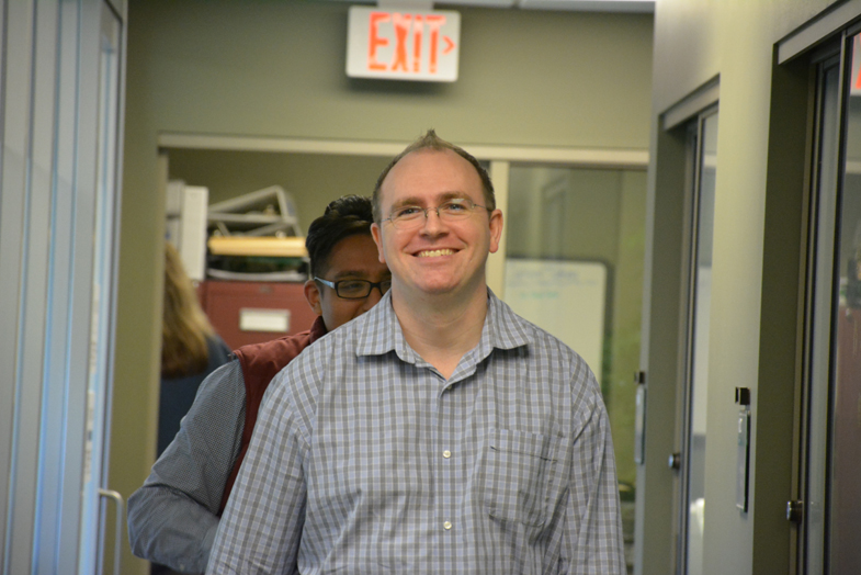
Coach Roff provided his Adobe Creative Cloud wizardry during the visual design process.
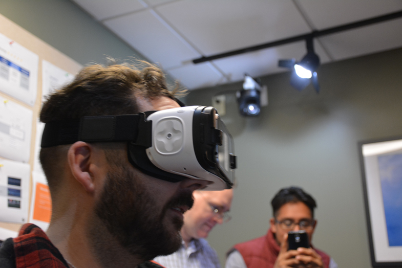
Coach Carter looking into the future.
— All Design Collective photographs were taken by the talented Olivera Teodorovic. —