The making of LAUNCHPAD 2
>> PROJECT – LAUNCHPAD 2 <<:// INTRO
I was very proud of the original Launchpad. Again, as being mentally challenged when it comes to HTML; I thought I had done a pretty good job.
The first issue arrived once I decided to expand on the first section. As everything was laid out in a grid-column-like style, adding one extra link made the grid look uneven.
Of course, my first idea was to try to cut down and make sure that all columns were aligned with the same number of links.
:// THE SOLUTION
After staring at the screen for a few hours and looking up more HTML, I realized I had hit a roadblock. In order to try to get more out of the basic layout I had created, I would need to combine some HTML, CSS and JavaScript (for that search bar I still want).
I do want to learn all of the above, but I wanted to stay within the limitations of basic HTML as I am (somewhat) capable of reading it and figuring out what’s going on. So, I did what I always do when in need of inspiration: look at Arch Linux baby.
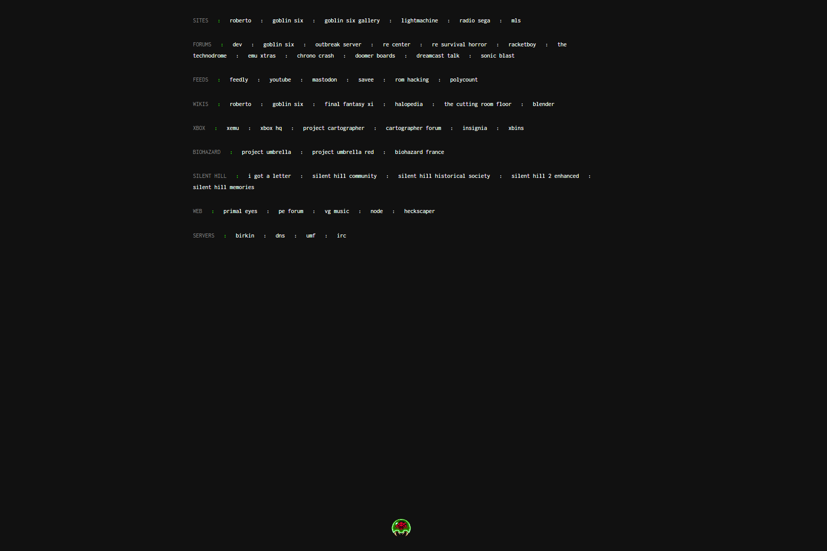
About one hour later I had it, Launchpad 2:

This new layout makes it really easy to add/remove/edit any section. The only thing missing was an anchor in the footer. I thought an animated Metroid gif would be appropriate:

I really want that search bar…